Bài thi IELTS Writing Task 1 thường gây khó khăn cho nhiều thí sinh bởi yêu cầu cao ở mọi kỹ năng (từ vựng, ngữ pháp, cách diễn đạt…) và tính học thuật ở mỗi dạng đề. Ở bài viết này, IZONE sẽ cung cấp thông tin về từng dạng câu hỏi thường gặp trong IELTS Writing Task 1 và các mẫu câu trả lời đạt band 8.0+, cùng tham khảo nhé!
Các câu hỏi thường gặp trong IELTS Writing Task 1
Line Graph – Biểu đồ đường
Với dạng bài Line Graph, thí sinh được cung cấp một hay nhiều biểu đồ và được yêu cầu miêu tả sự thay đổi của yếu tố nào đó được nhắc tới trong biểu đồ đó. Trong mỗi biểu đồ, đối với mỗi đối tượng, sẽ có đường nối các điểm và thể hiện xu hướng thay đổi theo thời gian. Độ khó của bài thi sẽ tăng dần lên khi tăng đối tượng cần được mô tả và số lượng đường. Thí sinh cần bổ sung thêm các kỹ năng đọc biểu đồ, thu thập và xử lý thông tin để có thể tái hiện lại chính xác, chi tiết và rõ ràng nhất sự thay đổi của đối tượng đó.
Line Graph là dạng bài thi phổ biến và linh hoạt nhất trong bài thi IELTS Writing Task 1.
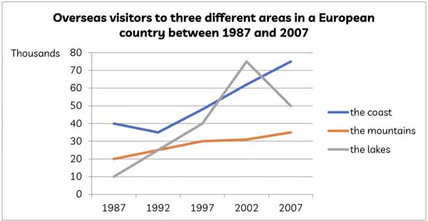
(Dạng Line Graph)
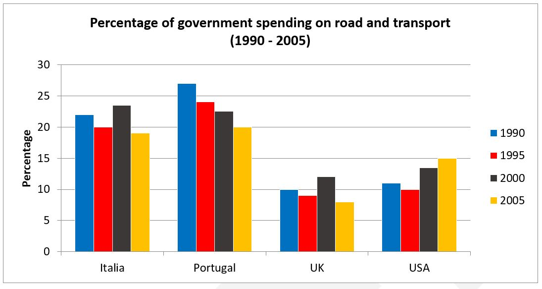
Bar Chart – Biểu đồ cột
Bar Chart là dạng đề bài cung cấp một hay nhiều biểu đồ, trong đó số liệu sẽ được biểu diễn dưới dạng cột đứng hoặc cột ngang. Thí sinh có thể được yêu cầu so sánh số liệu của các đối tượng tại một mốc thời gian hoặc miêu tả sự thay đổi của các đối tượng qua một khoảng thời gian cụ thể.
Tuỳ theo từng biểu đồ mà số liệu sẽ được biểu diễn dưới dạng trục đứng, trục ngang hay xếp chồng. Tuy hình thức khác nhau nhưng điều này không có tác động tới việc trình bày số liệu và triển khai bài làm của thí sinh. Bar Chart là một dạng bài thi phổ biến trong đề thi IELTS Writing Task 1.
(Dạng Bar Chart miêu tả nhiều đối tượng trong khoảng thời gian nhất định)
(Dạng Bar Chart so sánh giữa các đối tượng tại một mốc thời gian)
[Xem thêm]: Hướng dẫn cách viết IELTS Writing Task 1 chi tiết cho từng dạng bài
Pie Chart – Biểu đồ tròn
Pie Chart là dạng đề bài cung cấp một hay nhiều biểu đồ hình tròn, trong đó mỗi biểu đồ được chia thành nhiều phần thể hiện số liệu (ở dạng phần trăm) của các yếu tố cấu thành một đối tượng cụ thể. Yếu tố thời gian có thể được bổ sung. Chính vì lẽ đó, ở dạng bài này yêu cầu cao thí sinh khả năng phân tích, so sánh các đối tượng nói chung, xác định phần trăm cấu thành của các yếu tố trong từng biểu đồ. Sau khi phân tích, thí sinh cần đánh giá tầm quan trọng hay sự chi phối của các yếu tố đó.
Mỗi yếu tố cấu thành được hiển thị bằng các màu sắc và tên khác nhau để dễ phân biệt.
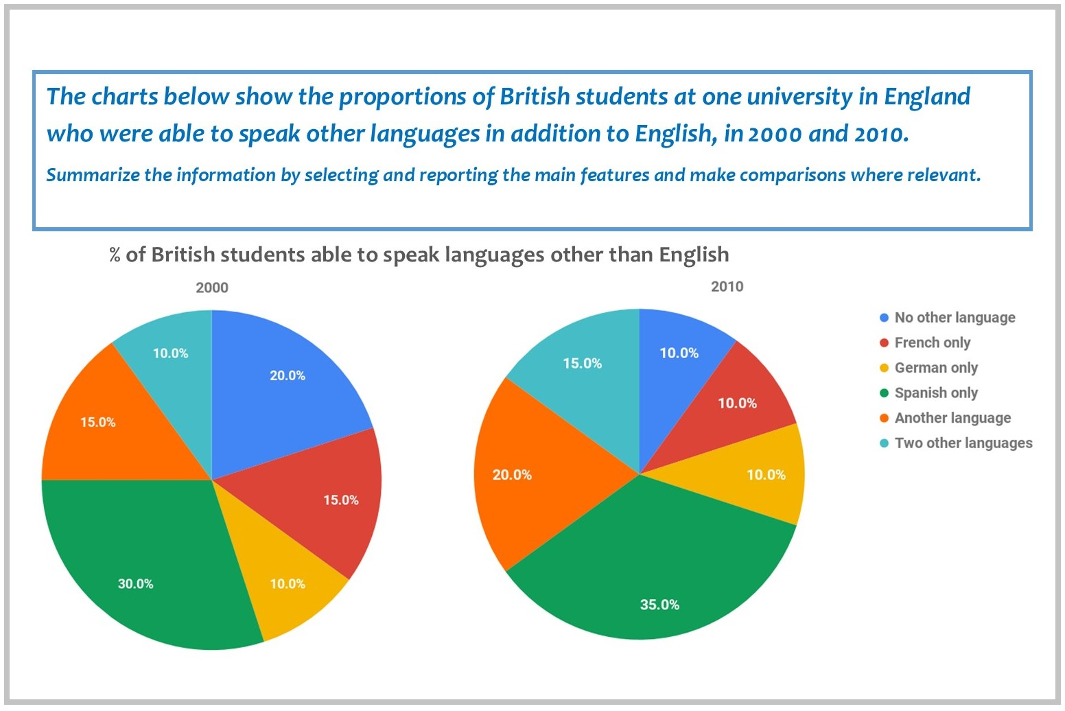
(Dạng Pie Chart)
Table – Bảng
Table là dạng câu hỏi mà đề bài sẽ cung cấp một hay nhiều bảng chứa số liệu về các đối tượng cụ thể. Thí sinh cần phân tích và so sánh các dữ liệu được đưa ra trong bảng (mô tả xu hướng hay thay đổi theo thời gian, so sánh các số liệu với nhau).
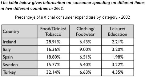
(Dạng Table)
Map – Bản đồ
Có hai dạng câu hỏi đối với dạng Map:
- Dạng bản đồ đơn: Đề bài cung cấp một biểu đồ thể hiện thông tin về một địa điểm cụ thể tại một mốc thời gian. Với dạng bài này, thí sinh chỉ cần miêu tả về cấu trúc, đặc điểm của các yếu tố trong bản đồ và ít phải so sánh. Chính vì lẽ đó, dạng bài này tương đối hiếm gặp trong bài thi IELTS Writing Task 1.
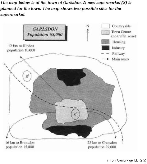
(Dạng biểu đồ đơn)
- Dạng biểu đồ kép: Đề bài cung cấp hai hay nhiều hơn hai bản đồ của một địa điểm trong các mốc thời gian khác nhau. Dạng câu hỏi này yêu cầu thí sinh kỹ năng phức tạp, kiến thức ngữ pháp (thì hiện tại, quá khứ, tương lai) chắc chắn bởi phải phân tích, so sánh sự thay đổi của đối tượng trong các mốc thời gian khác nhau. Dạng biểu đồ kép thường xuyên xuất hiện trong bài thi IELTS Writing Task 1.
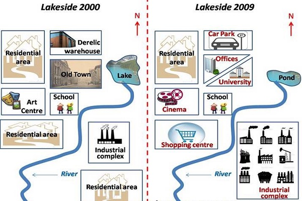
(Dạng biểu đồ kép)
[Xem thêm]: Chuyên mục Writing 6.0 – 8.0 với các bài Phân tích đề Writing task 1
Process – Quy trình
Dạng Process cung cấp cho thí sinh một quá trình tự nhiên (như vòng tuần hoàn, vòng đời của các loài sinh vật) hay quá trình nhân tạo (như quy trình sản xuất, chế biến,…). Thí sinh phải mô tả, phân tích cụ thể và chi tiết từng bước của quá trình đó. Đặc biệt không được bỏ sót bất kỳ phần nào.
Dạng bài Process đang được chuyên gia IELTS yêu thích và có tần suất xuất hiện cao trong bài thi IELTS Writing Task 1 dạo gần đây.
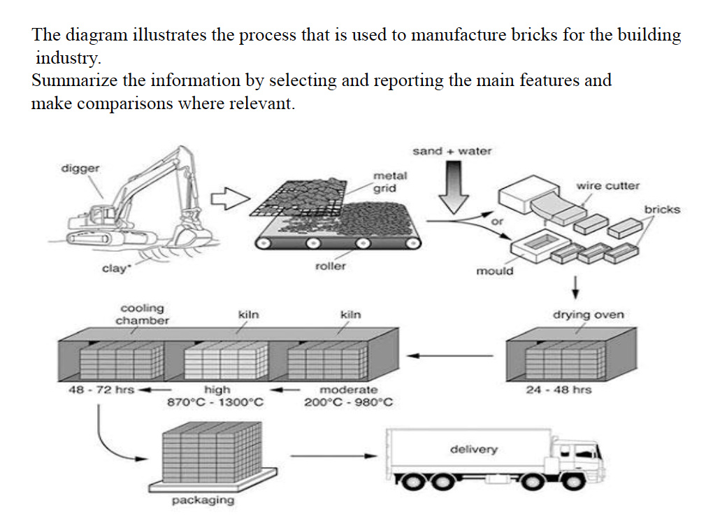
(Dạng Process)
Mixed Charts – Biểu đồ tích hợp
Với dạng Mixed Charts, đề bài cung cấp nhiều biểu đồ ở các dạng khác nhau, yêu cầu thí sinh phải mô tả đặc điểm của các đối tượng được nêu trong từng biểu đồ. (Ví dụ: biểu đồ tròn và bảng, biểu đồ đường và biểu đồ tròn,….) Các thông tin các biểu đồ khác nhau có liên quan mật thiết. Thí sinh cần kết hợp kỹ năng cụ thể ở các dạng biểu đồ để phân tích đặc điểm của đối tượng cụ thể và chi tiết nhất.
(Dạng Mixed Charts)
Tổng hợp mẫu câu trả lời IELTS Writing Task 1 hay
Mẫu câu trả lời IELTS Writing Task 1 dạng Line Graph – biểu đồ đường
Model Answer:
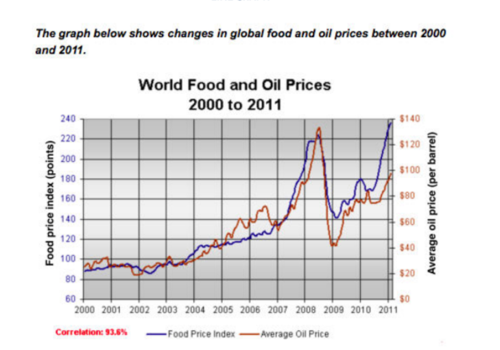
The line graph compares the average price of a barrel of oil with the food price index over a period of 11 years.
It is clear that average global prices of both oil and food rose considerably between 2000 and 2011. Furthermore, the trends for both commodities were very similar, and so a strong correlation (93.6%) is suggested.
In the year 2000, the average global oil price was close to $25 per barrel, and the food price index stood at just under 90 points. Over the following four years both prices remained relatively stable, before rising steadily between 2004 and 2007. By 2007, the average oil price had more than doubled, to nearly $60 per barrel, and food prices had risen by around 50 points.
A dramatic increase in both commodity prices was seen from 2007 to 2008, with oil prices reaching a peak of approximately $130 per barrel and the food price index rising to 220 points. However, by the beginning of 2009 the price of oil had dropped by roughly $90, and the food price index was down by about 80 points. Finally, in 2011, the average oil price rose once again, to nearly $100 per barrel, while the food price index reached its peak, at almost 240 points.
Model Answer:
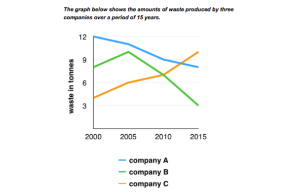
The line graph compares three companies in terms of their waste output between the years 2000 and 2015.
It is clear that there were significant changes in the amounts of waste produced by all three companies shown on the graph. While companies A and B saw waste output fall over the 15-year period, the amount of waste produced by company C increased considerably.
In 2000, company A produced 12 tonnes of waste, while companies B and C produced around 8 tonnes and 4 tonnes of waste material respectively. Over the following 5 years, the waste output of companies B and C rose by around 2 tonnes, but the figure for company A fell by approximately 1 tonne.
From 2005 to 2015, company A cut waste production by roughly 3 tonnes, and company B reduced its waste by around 7 tonnes. By contrast, company C saw an increase in waste production of approximately 4 tonnes over the same 10-year period. By 2015, company Cǯs waste output had risen to 10 tonnes, while the respective amounts of waste from companies A and B had dropped to 8 tonnes and only 3 tonnes.
Model Answer:
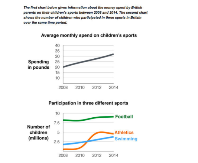
The line graphs show the average monthly amount that parents in Britain spent on their childrenǯs sporting activities and the number of British children who took part in three different sports from 2008 to 2014.
It is clear that parents spent more money each year on their children’s participation in sports over the six-year period. In terms of the number of children taking part, football was significantly more popular than athletics and swimming.
In 2008, British parents spent an average of around £20 per month on their childrenǯs sporting activities. Parentsǯ spending on childrenǯs sports increased gradually over the following six years, and by 2014 the average monthly amount had risen to just over £30.
Looking at participation numbers, in 2008 approximately 8 million British children played football, while only 2 million children were enrolled in swimming clubs and less than 1 million practised athletics. The figures for football participation remained relatively stable over the following 6 years. By contrast, participation in swimming almost doubled, to nearly 4 million children, and there was a near fivefold increase in the number of children doing athletics.
Model Answer:
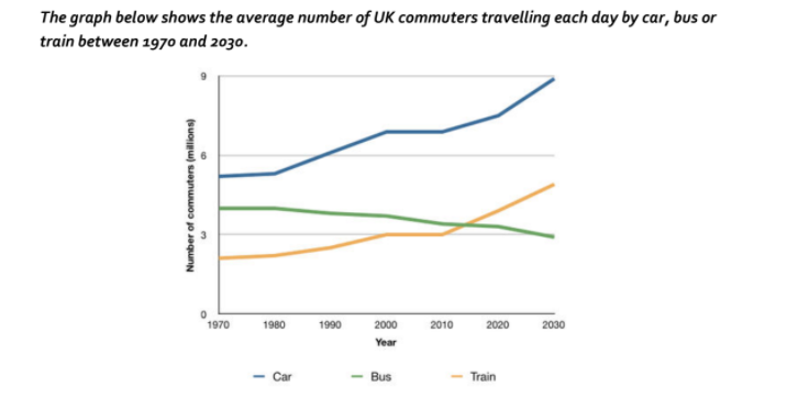
The line graph compares figures for daily travel by workers in the UK using three different forms of transport over a period of 60 years.
It is clear that the car is by far the most popular means of transport for UK commuters throughout the period shown. Also, while the numbers of people who use the car and train increase gradually, the number of bus users falls steadily.
In 1970, around 5 million UK commuters travelled by car on a daily basis, while the bus and train were used by about 4 million and 2 million people respectively. In the year 2000, the number of those driving to work rose to 7 million and the number of commuting rail passengers reached 3 million. However, there was a small drop of approximately 0.5 million in the number of bus users.
By 2030, the number of people who commute by car is expected to reach almost 9 million, and the number of train users is also predicted to rise, to nearly 5 million. By contrast, buses are predicted to become a less popular choice, with only 3 million daily users.
Model Answer:
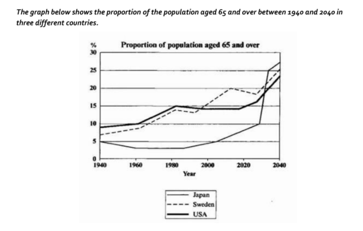
The line graph compares the percentage of people aged 65 or more in three countries over a period of 100 years.
It is clear that the proportion of elderly people increases in each country between 1940 and 2040. Japan is expected to see the most dramatic changes in its elderly population.
In 1940, around 9% of Americans were aged 65 or over, compared to about 7% of Swedish people and 5% of Japanese people. The proportions of elderly people in the USA and Sweden rose gradually over the next 50 years, reaching just under 15% in 1990. By contrast, the figures for Japan remained below 5% until the early 2000s.
Looking into the future, a sudden increase in the percentage of elderly people is predicted for Japan, with a jump of over 15% in just 10 years from 2030 to 2040. By 2040, it is thought that around 27% of the Japanese population will be 65 years old or more, while the figures for Sweden and the USA will be slightly lower, at about 25% and 23% respectively.
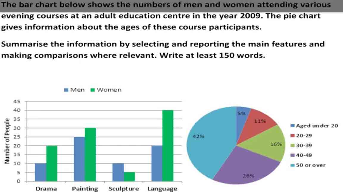
Model Answer:
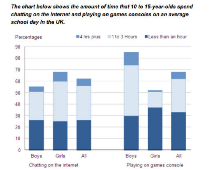
The bar chart compares the time spent by 10 to 15- year-olds in the UK on two activities, namely chatting online and playing computer games.
Overall, we can see that playing computer games is marginally more popular than chatting on the Internet. However, completely different trends can be seen if we look at the specific figures for boys and girls.
Boys aged between 10 and 15 clearly favour playing on games consoles over chatting online. According to the chart, while 85% of boys play computer games every day, only 55% chat online daily. Furthermore, the majority of boys play on their consoles for more than one hour each day, and 10% do this activity for four hours or more.
By contrast, girls prefer chatting online. Close to 70% of 10 to 15-year-old girls engage in online conversation each day, compared to about 50% of this cohort who play computer games. Of the girls who do play on consoles, most of them play for less than an hour, whereas most girls who chat online do so for more than one hour, and nearly 10% chat for four hours or more.
Model Answer:
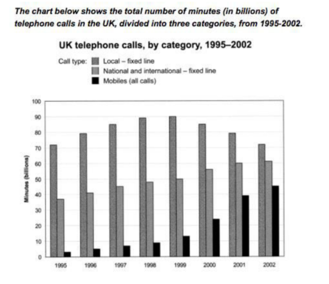
The bar chart compares the amount of time spent by people in the UK on three different types of phone call between 1995 and 2002.
It is clear that calls made via local, fixed lines were the most popular type, in terms of overall usage, throughout the period shown. The lowest figures on the chart are for mobile calls, but this category also saw the most dramatic increase in user minutes.
In 1995, people in the UK used fixed lines for a total of just over 70 billion minutes for local calls, and about half of that amount of time for national or international calls. By contrast, mobile phones were only used for around 4 billion minutes. Over the following four years, the figures for all three types of phone call increased steadily.
By 1999, the amount of time spent on local calls using landlines had reached a peak at 90 billion minutes. Subsequently, the figure for this category fell, but the rise in the other two types of phone call continued. In 2002, the number of minutes of national / international landline calls passed 60 billion, while the figure for mobiles rose to around 45 billion minutes.
Model Answer:
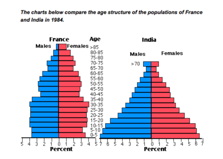
The two charts compare the populations of France and India in terms of age distribution by gender in the year 1984.
It is clear that the population of India was younger than that of France in 1984, with a noticeably larger proportion of people aged under 20. France, on the other hand, had a significantly larger percentage of elderly inhabitants.
In India, close to 14% of people were aged 5 or under, and each five-year age bracket above this contained an increasingly smaller proportion of the population. France’s population, by contrast, was more evenly distributed across the age ranges, with similar figures (around 7% to 8% of all people) for each five-year cohort between the ages of 0 and 40. Somewhere between 10% and 15% of all French people were aged 70 or older, but the equivalent figure for India was only 2%.
Looking more closely at gender, there was a noticeably higher proportion of French women than men in every cohort from age 50 upwards. For example, almost 3% of French 70- to 75-year-olds were women, while just under 2% were men. No significant gender differences can be seen on the Indian population chart.
Model Answer:
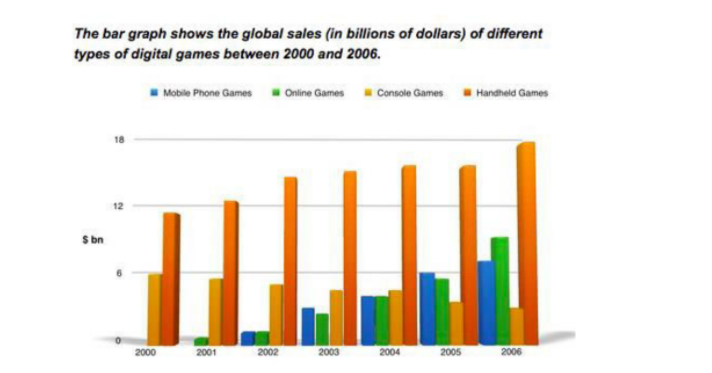
The bar chart compares the turnover in dollars from sales of video games for four different platforms, namely mobile phones, online, consoles and handheld devices, from 2000 to 2006.
It is clear that sales of games for three out of the four platforms rose each year, leading to a significant rise in total global turnover over the 7- year period. Sales figures for handheld games were at least twice as high as those for any other platform in almost every year.
In 2000, worldwide sales of handheld games stood at around $11 billion, while console games earned just under $6 billion. No figures are given for mobile or online games in that year. Over the next 3 years, sales of handheld video games rose by about $4 billion, but the figure for consoles decreased by $2 billion. Mobile phone and online games started to become popular, with sales reaching around $3 billion in 2003.
In 2006, sales of handheld, online and mobile games reached peaks of 17, 9 and 7 billion dollars respectively. By contrast, turnover from console games dropped to its lowest point, at around $2.5 billion.

Model Answer:
The pie charts compare visitors’ responses to a survey about customer service at the Parkway Hotel in 2005 and in 2010.
It is clear that overall customer satisfaction increased considerably from 2005 to 2010. While most hotel guests rated customer service as satisfactory or poor in 2005, a clear majority described the hotel’s service as good or excellent in 2010.
Looking at the positive responses first, in 2005 only 5% of the hotelǯs visitors rated its customer service as excellent, but this figure rose to 28% in 2010. Furthermore, while only 14% of guests described customer service in the hotel as good in 2005, almost three times as many people gave this rating five years later.
With regard to negative feedback, the proportion of guests who considered the hotelǯs customer service to be poor fell from 21% in 2005 to only 12% in 2010. Similarly, the proportion of people who thought customer service was very poor dropped from 15% to only 4% over the 5-year period. Finally, a fall in the number of Ǯsatisfactoryǯ ratings in 2010 reflects the fact that more people gave positive responses to the survey in that year.
Model Answer:
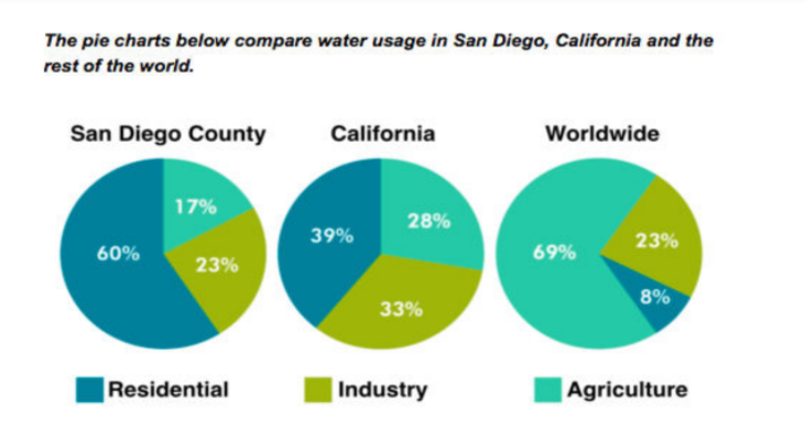
The pie charts give information about the water used for residential, industrial and agricultural purposes in San Diego County, California, and the world as a whole.
It is noticeable that more water is consumed by homes than by industry or agriculture in the two American regions. By contrast, agriculture accounts for the vast majority of water used worldwide.
In San Diego County and California State, residential water consumption accounts for 60% and 39% of total water usage. By contrast, a mere 8% of the water used globally goes to homes. The opposite trend can be seen when we look at water consumption for agriculture. This accounts for a massive 69% of global water use, but only 17% and 28% of water usage in San Diego and California respectively.
Such dramatic differences are not seen when we compare the figures for industrial water use. The same proportion of water (23%) is used by industry in San Diego and worldwide, while the figure for California is 10% higher, at 33%.

Model Answer:
The pie charts compare the expenditure of a school in the UK in three different years over a 20- year period.
It is clear that teachersǯ salaries made up the largest proportion of the schoolǯs spending in all three years (1981, 1991 and 2001). By contrast, insurance was the smallest cost in each year.
In 1981, 40% of the school’s budget went on teachersǯ salaries. This figure rose to 50% in 1991, but fell again by 5% in 2001. The proportion of spending on other workersǯ wages fell steadily over the 20-year period, from 28% of the budget in 1981 to only 15% in 2001.
Expenditure on insurance stood at only 2% of the total in 1981, but reached 8% in 2001. Finally, the percentages for resources and furniture/equipment fluctuated. The figure for resources was highest in 1991, at 20%, and the proportion of spending on furniture and equipment reached its peak in 2001, at 23%.
Model Answer:
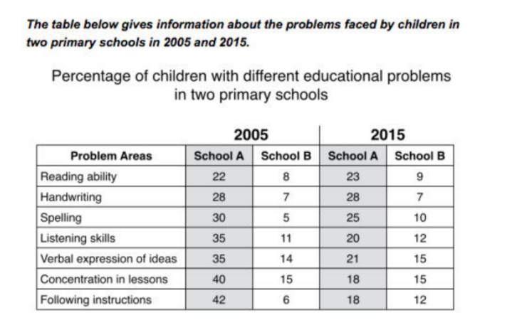
The table compares two primary schools in terms of the proportions of their pupils who experienced seven different educational problems in the years 2005 and 2015.
It is noticeable that school A had higher proportions of children with all seven educational difficulties in both years. However, while school A managed to reduce the incidence of most of the problems between 2005 and 2015, school B saw an overall rise in the percentage of children who were struggling.
In 2005, 42% of school Aǯs pupils found it difficult to follow instructions, whereas only 6% of pupils in school B experienced this problem. Similarly, between 30 and 40 per cent of children attending school A had problems in the areas of spelling, listening, verbal expression and concentration in lessons, while the equivalent figures for school B stood at between 5 and 15 per cent.
In 2015, the difference between the two schools was less pronounced. Notably, the proportion of children who struggled to follow instructions fell by 24% in school A, and this school also saw falls of 22%, 15%, 14% and 5% in the figures for children who had problems with concentration, listening, verbal expression and spelling. In school B, however, the proportion of children who struggled with spelling and following instructions doubled, to 10% and 12% respectively, and there was almost no change in the incidence of listening, verbal or concentration problems.
Model Answer:
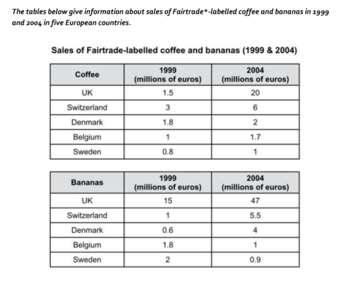
The tables show the amount of money spent on Fairtrade coffee and bananas in two separate years in the UK, Switzerland, Denmark, Belgium and Sweden.
It is clear that sales of Fairtrade coffee rose in all five European countries from 1999 to 2004, but sales of Fairtrade bananas only went up in three out of the five countries. Overall, the UK saw by far the highest levels of spending on the two products.
In 1999, Switzerland had the highest sales of Fairtrade coffee, at €͛ million, while revenue from Fairtrade bananas was highest in the UK, at €͙͝ million. By 2004, however, sales of Fairtrade coffee in the UK had risen to €͚͘ million, and this was over three times higher than Switzerlandǯs sales figure for Fairtrade coffee in that year. The year 2004 also saw dramatic increases in the money spent on Fairtrade bananas in the UK and Switzerland, with revenues rising by €͚͛ million and €͜.͝ million respectively.
Sales of the two Fairtrade products were far lower in Denmark, Belgium and Sweden. Small increases in sales of Fairtrade coffee can be seen, but revenue remained at €͚ million or below in all three countries in both years. Finally, it is noticeable that the money spent on Fairtrade bananas actually fell in Belgium and Sweden.
Model Answer:
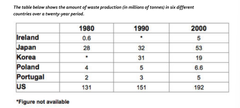
The chart compares the amounts of waste that were produced in six countries in the years 1980, 1990 and 2000.
In each of these years, the US produced more waste than Ireland, Japan, Korea, Poland and Portugal combined. It is also noticeable that Korea was the only country that managed to reduce its waste output by the year 2000.
Between 1980 and 2000, waste production in the US rose from 131 to 192 million tonnes, and rising trends were also seen in Japan, Poland and Portugal. Japanǯs waste output increased from 28 to 53 million tonnes, while Poland and Portugal saw waste totals increase from 4 to 6.6 and from 2 to 5 million tonnes respectively.
The trends for Ireland and Korea were noticeably different from those described above. In Ireland, waste production increased more than eightfold, from only 0.6 million tonnes in 1980 to 5 million tonnes in 2000. Korea, by contrast, cut its waste output by 12 million tonnes between 1990 and 2000.
Model Answer:
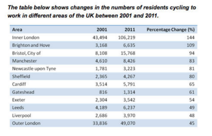
The table compares the numbers of people who cycled to work in twelve areas of the UK in the years 2001 and 2011.
Overall, the number of UK commuters who travelled to work by bicycle rose considerably over the 10-year period. Inner London had by far the highest number of cycling commuters in both years.
In 2001, well over 43 thousand residents of inner London commuted by bicycle, and this figure rose to more than 106 thousand in 2011, an increase of 144%. By contrast, although outer London had the second highest number of cycling commuters in each year, the percentage change, at only 45%, was the lowest of the twelve areas shown in the table.
Brighton and Hove saw the second biggest increase (109%) in the number of residents cycling to work, but Bristol was the UKǯs second city in terms of total numbers of cycling commuters, with 8,108 in 2001 and 15,768 in 2011. Figures for the other eight areas were below the 10 thousand mark in both years.
Model Answer:
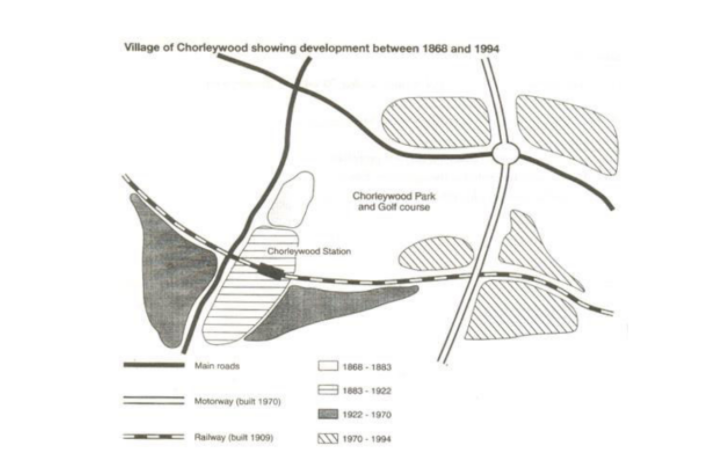
The map shows the growth of a village called Chorleywood between 1868 and 1994.
It is clear that the village grew as the transport infrastructure was improved. Four periods of development are shown on the map, and each of the populated areas is near to the main roads, the railway or the motorway.
From 1868 to 1883, Chorleywood covered a small area next to one of the main roads. Chorleywood Park and Golf Course is now located next to this original village area. The village grew along the main road to the south between 1883 and 1922, and in 1909 a railway line was built crossing this area from west to east. Chorleywood station is in this part of the village.
The expansion of Chorleywood continued to the east and west alongside the railway line until 1970. At that time, a motorway was built to the east of the village, and from 1970 to 1994, further development of the village took place around motorway intersections with the railway and one of the main roads.
Model Answer:
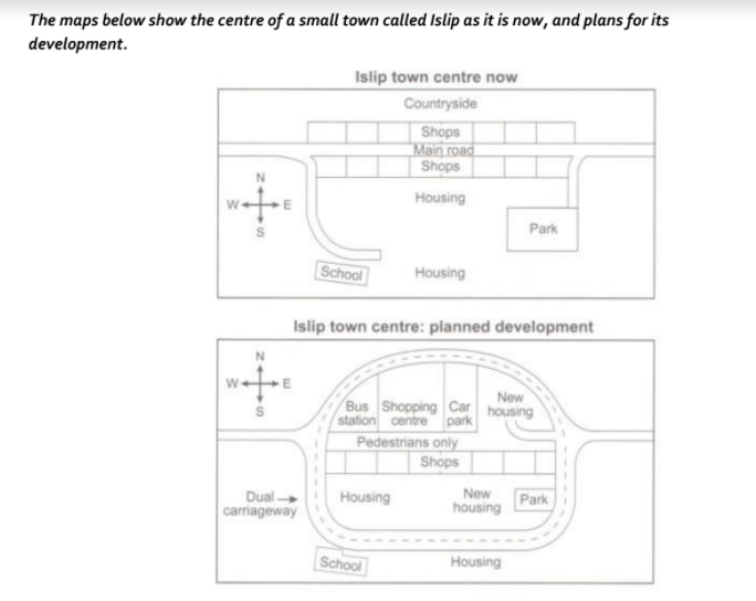
The diagrams illustrate some proposed changes to the central area of the town of Islip.
It is clear that the principal change to the town will be the construction of a ring road around the centre. Various other developments with regard to shops and housing will accompany the building of this road.
Looking at the map of Islip as it is now, we can see that a main road runs through its centre from east to west. The second map shows the planned pedestrianisation of this road. Traffic will be diverted onto a dual carriageway that will form a ring around the town centre.
Currently there is a row of shops along either side of the main road. However, it appears that the shops along the north side of the new pedestrian street will be demolished to make way for a bus station, shopping centre, car park and new housing area. The shops along the south side of the street will remain, but it seems that the town’s park will be reduced in size so that more new houses can be built within the ring road.
Model Answer:
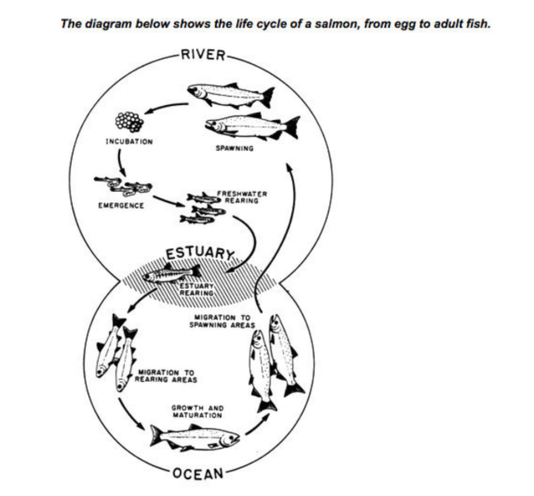
The diagram illustrates the stages in the life of the salmon, from birth to maturity.
It is clear that there are six* main stages as the salmon develops from egg to mature adult. We can also see that salmon spend time in three distinct locations during the cycle, moving from river to estuary to ocean and then back upstream.
Salmon begin their lives in rivers where the adult fish lay and incubate their eggs. After emerging from eggs, the young salmon spend the next stage of their lives being reared in freshwater areas. Then, at some point in their development, the fish swim downstream to river estuaries where rearing continues.
Following the estuary rearing period, the maturing salmon migrate to the ocean, where they eventually become fully grown adults. Finally, the adult fish travel back upstream to spawning areas of rivers; here they reproduce and lay their eggs, and the life cycle begins anew.
Model Answer
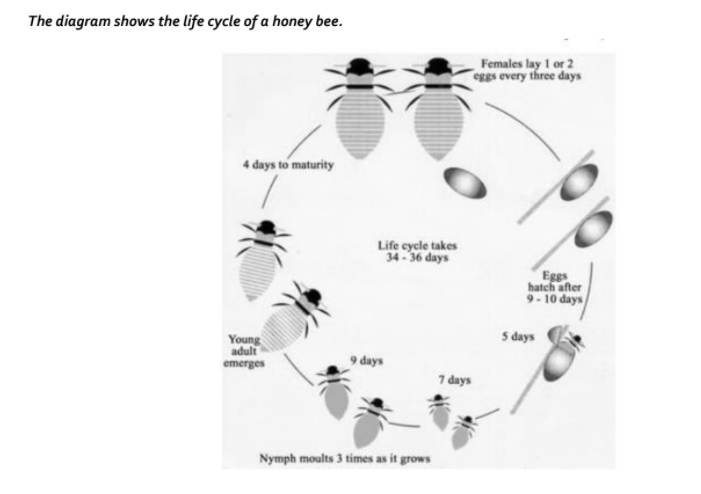
The diagram illustrates the various stages in the life of a honey bee.
We can see that the complete life cycle lasts between 34 and 36 days. It is also noticeable that there are five main stages in the development of the honey bee, from egg to mature adult insect.
The life cycle of the honey bee begins when the female adult lays an egg; the female typically lays one or two eggs every 3 days. Between 9 and 10 days later, each egg hatches and the immature insect, or nymph, appears.
During the third stage of the life cycle, the nymph grows in size and sheds its skin three times. This moulting first takes place 5 days after the egg hatches, then 7 days later, and again another 9 days later. After a total of 30 to 31 days from the start of the cycle, the young adult honey bee emerges from its final moulting stage, and in the space of only 4 days it reaches full maturity.
Model Answer:
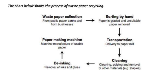
The flow chart shows how waste paper is recycled.
It is clear that there are six distinct stages in this process, from the initial collection of waste paper to the eventual production of usable paper.
At the first stage in the paper recycling process, waste paper is collected either from paper banks, where members of the public leave their used paper, or directly from businesses. This paper is then sorted by hand and separated according to its grade, with any paper that is not suitable for recycling being removed. Next, the graded paper is transported to a paper mill.
Stages four and five of the process both involve cleaning. The paper is cleaned and pulped, and foreign objects such as staples are taken out. Following this, all remnants of ink and glue are removed from the paper at the de-inking stage. Finally, the pulp can be processed in a paper making machine, which makes the end product: usable paper.
Model Answer:
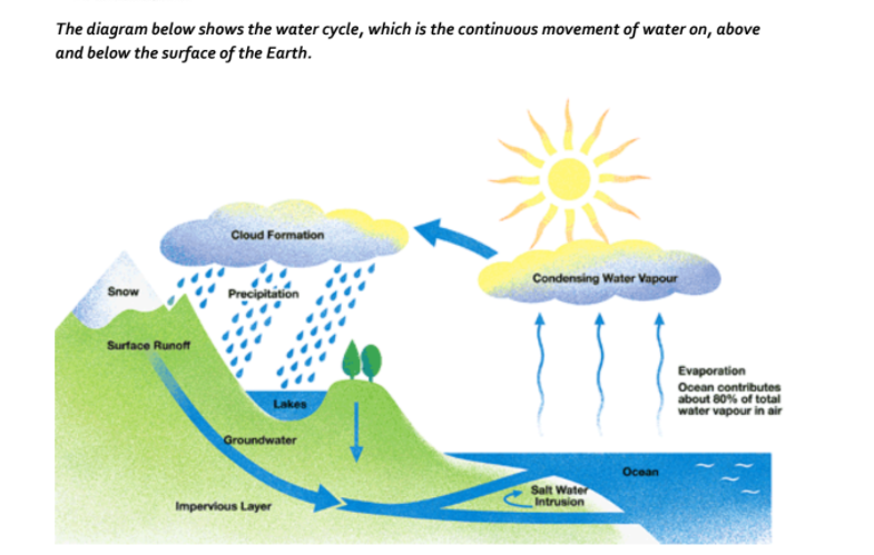
The picture illustrates the way in which water passes from ocean to air to land during the natural process known as the water cycle.
Three main stages are shown on the diagram. Ocean water evaporates, falls as rain, and eventually runs back into the oceans again.
Beginning at the evaporation stage, we can see that 80% of water vapour in the air comes from the oceans. Heat from the sun causes water to evaporate, and water vapour condenses to form clouds. At the second stage, labelled “precipitation” on the diagram, water falls as rain or snow.
At the third stage in the cycle, rainwater may take various paths. Some of it may fall into lakes or return to the oceans via “surface runoff’. Otherwise, rainwater may filter through the ground, reaching the impervious layer of the earth. Salt water intrusion is shown to take place just before groundwater passes into the oceans to complete the cycle.
Model Answer:
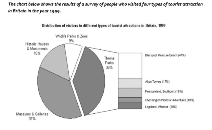
The pie chart compares figures for visitors to four categories of tourist attraction and to five different theme parks in Britain in 1999.
It is clear that theme parks and museums/ galleries were the two most popular types of tourist attraction in that year. Blackpool Pleasure Beach received by far the highest proportion of visitors in the theme park sector.
Looking at the information in more detail, we can see that 38% of the surveyed visitors went to a theme park, and 37% of them went to a museum or gallery. By contrast, historic houses and monuments were visited by only 16% of the sample, while wildlife parks and zoos were the least popular of the four types of tourist attraction, with only 9% of visitors.
In the theme park sector, almost half of the people surveyed (47%) had been to Blackpool Pleasure Beach. Alton Towers was the second most popular amusement park, with 17% of the sample, followed by Pleasureland in Southport, with 16%. Finally, Chessington World of Adventures and Legoland Windsor had each welcomed 10% of the surveyed visitors.
Model Answer:
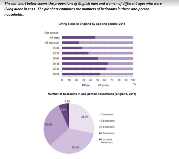
The two charts give information about single-occupant households in England in the year 2011. The bar chart compares figures for occupants’ age and gender, and the pie chart shows data about the number of bedrooms in these homes.
Overall, females made up a higher proportion of people living alone than males, and this difference is particularly noticeable in the older age categories. We can also see that the most common number of bedrooms in a single-occupant home was two.
A significant majority of the people aged 65 or over who were living alone in England in 2011 were female. Women made up around 72% of single occupants aged 75 to 84, and 76% of those aged 85 or over. By contrast, among younger adults the figures for males were higher. For example, in the 35-49 age category, men accounted for nearly 65% of people living alone.
In the same year, 35.4% of one-person households in England had two bedrooms, while one-bedroom and three-bedroom homes accounted for 28% and 29.8% of the total. Under 7% of single-occupant homes had four or more bedrooms.
Model Answer:
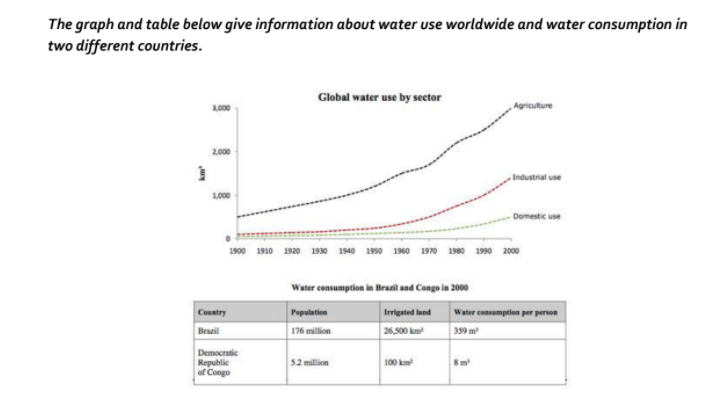
The charts compare the amount of water used for agriculture, industry and homes around the world, and water use in Brazil and the Democratic Republic of Congo.
It is clear that global water needs rose significantly between 1900 and 2000, and that agriculture accounted for the largest proportion of water used. We can also see that water consumption was considerably higher in Brazil than in the Congo.
In 1900, around 500km3 of water was used by the agriculture sector worldwide. The figures for industrial and domestic water consumption stood at around one fifth of that amount. By 2000, global water use for agriculture had increased to around 3000km3, industrial water use had risen to just under half that amount, and domestic consumption had reached approximately 500km3.
In the year 2000, the populations of Brazil and the Congo were 176 million and 5.2 million respectively. Water consumption per person in Brazil, at 359m3, was much higher than that in the Congo, at only 8m3, and this could be explained by the fact that Brazil had 265 times more irrigated land.
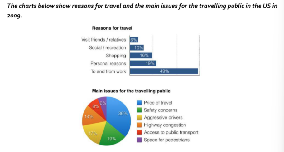
Model Answer:
The bar chart and pie chart give information about why US residents travelled and what travel problems they experienced in the year 2009.
It is clear that the principal reason why Americans travelled in 2009 was to commute to and from work. In the same year, the primary concern of Americans, with regard to the trips they made, was the cost of travelling.
Looking more closely at the bar chart, we can see that 49% of the trips made by Americans in 2009 were for the purpose of commuting. By contrast, only 6% of trips were visits to friends or relatives, and one in ten trips were for social or recreation reasons. Shopping was cited as the reason for 16% of all travel, while unspecific Ǯpersonal reasonsǯ accounted for the remaining 19%.
According to the pie chart, price was the key consideration for 36% of American travellers. Almost one in five people cited safety as their foremost travel concern, while aggressive driving and highway congestion were the main issues for 17% and 14% of the travelling public. Finally, a total of 14% of those surveyed thought that access to public transport or space for pedestrians were the most important travel issues.